Thursday, 29 November 2012
Things I have learnt from my Audience Feedback
Overall, I am happy with the feedback I have received as it has generally been mostly positive, and it has made me feel more confident in my work. Some things that were seen as strong positives from my target audience were: Mes en scene, camera angles, use of different shots and lenses, narrative, lyrics matching narrative, location and good acting/singing from main artist. As these things have had only positive feedback, I do not plan on changing them as my target audience seem happy with these features within my work. This is very reassuring as it is essential that my target audience like almost all features in my music promo, as this will allow it to be as successful as possible. One thing I am particularly happy about is the fact that I have had only positive feedback when it comes to my story line this is great as it means that my target audience are more likely to watch my music video over and over again as they like the story within my video and they think it works well with the lyrics.
When it comes to my ancillary work, I have had only positive feedback which makes me very happy! Before I did my Audience Feedback I was generally happy with how my Ancillary work looked and hoped that it was seen as effective from my target audience. I am pleased that one person from my audience feedback even said "If I saw this in a magazine I would definitely stop to read it." This is really reassuring and has made me feel more confident in my work, as my audience feedback has shown me that I targeting my audience correctly and in an effective way.
However, I have also learnt from my Audience Feedback that there are things which I need to improve upon. I am glad that not all my feedback has been positive, as negative feedback allows me to improve on my work and make it even better and more suited to my target audience. Most of the negative features that were mentioned within my Audience feedback were to do with the editing, which is fine as I can easily go back to my work on Final Cut and re-edit certain aspects. For example, I will make sure that I cut out the close up of the "other man" in my music promo, as his facial expression and the short clip made this part seem awkward and unprofessional to my audience. I will therefore only show the "other man" walking off with the female at the end of my music promo as I think this will look more effective.
Another thing I need to adjust would be the jumpy cuts within my music promo, as two people picked up on certain shots being slightly jilted and making my music promo look unprofessional. I will therefore go over my editing and try to sort out as many of these as possible. As well as this, it is important that the lips inking within my music promo looks as professional as possible. This is particularly important as it makes a real impact on how effective my music promo is as a whole, and I do not want my target audience to see the artist in a negative light. I therefore need to go over all singing scenes and ensure that they are perfectly timed.
One comment from my target audience which really helped me was the last comment, although it is mostly negative it has really helped me when it comes to improving my work. As it mentions that not all of my music promo flows, for example I go to stand up at one point in the video and in the next scene I am then shown sitting down. This is not an obvious flaw as you are only shown the top half of me, but when you look closely you can see that I am in a slightly different location and my body language suggests I am sitting as I am hunched over. This is something I plan to correct by sorting out the order of my shots and ensuring that everything flows in a clear and professional way.
I also learnt from the last comment that certain shots can be quite slow, for example there is a scene in the middle of my music promo of the main artist skating after the girl going into the underpass. This wasn't very effective as I cross dissolved the two scenes of him skating round a corner together and unfortunately that meant that the main artist went out of shot for a long amount of time. It is important that I therefore crop this down, and even adjust the speed of the shot to ensure that he is in scene for as long as possible.
Once I have taken all of these comments into account within my work and changed things within my music promo to ensure that it is as effective as possible I hope that I will be left with something that my target audience are likely to enjoy and watch over and over again. As I feel that my music promo has the potential to be really popular within my target audience, and I am glad that I had positive feedback when it came to the narrative and filming as these features are really important within my music promo. If I had received strong negative comments that were to do with my storyline this would have really concerned me and I would have been worried that I wasn't reaching out to the correct target audience. I am also glad that almost all of my negative feedback can be improved with the help of Final Cut as it is easy for me to go back to my second draft and correct it in certain places.
Monday, 26 November 2012
Results from Audience Feedback
Although I asked over 20 young adults to get back to me and give me feedback for my music promo, this is all I have received so far:
"Wow Olivia! This is really good!! I love the style of it all and the Mes en Scene, it looks really believable and professional. :) The colours in the skatepark are great too. I think you've filmed it all really well and the story is nice and clear. I think it's great the way it is, maybe make a couple of small changes like singing being out of time at the beginning and it was a bit juddery at times. Your album and advert are really impressive too, they look super professional and I love the pictures you have used throughout it."
"Your album looks so good! I love the main image on the front I think it works really well with the music video!The narrative is brilliant, I think you've done a really good job because it's nice and clear :) the skating also adds to the storyline by making it a bit more unique and interesting. As romantic music videos can sometimes be very boring! The skating works really well with it though and makes it more boy friendly. My favourite thing about your music video would be Robs [the main artists] singing!! It's actually very professional and looks so believable. Well done :)"
"Your music video and print work work really well.One thing that you could improve on was the shot of the new boy smiling near the end of the music video. I think he looks really awkward :( but the idea of her cheating and being with someone else is great because it works well with the lyrics so I would still use the idea just change that tiny bit. I like the locations which you have filmed in, the business park is really interesting and unique as I would never have thought to film in such a place but I think it really works within your music video."
"I think you've done a fantastic job in terms of matching the story to the lyrics. All of the song works well with what you're seeing :) like when the lyrics of "She had a lover" play and you have shown her phone with a text from another boy which works well! And in other parts of the song where there is no singing, just instrumental you have included less acting and just shown shots of the scenery for example I think the shot in the underpass where you've used a special lens looks fantastic. My only negative would be that some of the shots are a bit shakey and maybe need going over :) The print work you've done looks brilliant, you've done a great job making that look really professional. If I saw that being advertised in a magazine I would definitely stop to read it."
"I bet Rob loved being your singer! He's actually done such a good job haha I'm really surprised!! Well done both of you :) My favourite thing would probably be the use of different camera angles you have used, as it look way more professional than if you were to just film all of it handheld. I'm guessing you used a tripod for most of it and that has really paid off. I loved the fisheye lens effect, it really made an impact in certain scenes and gave it that extra something! I also like the use of blur you have used and you've done a great job with editing as it looks really profesh! Very proud of you for this, it looks amazing!"
"You've done a good job with filming and I like the storyline but have some issues with the editing. His singing it slightly out of time at times, which you need to correct. As well as this, certain aspects don't flow for example when you're (the girl) waiting for the second boy under the archway, the video shows a quick clip of you standing up and then it goes back to a clip of you sitting down again. Just little things like that are things you need to touch up. Another thing I thought could be improved was the clip of Rob skating after you at the beginning. As it dissolves to him going round a corner and then takes awhile for him to come back into shot, so I would sort that out as well. Overall though it's really great just thought I would help you improve it a little."
Thursday, 22 November 2012
Audience feedback
To ensure that I get reliable audience feedback from the right sources, I facebook messages over 20 young adults that fall into my target audience to look at my music promo so they can then message me back telling me what I could improve on and why, as well as what they think is successful within my work. It is important that I ask both males and females, as my chosen artist is a typical Alternative genre which is popular with both male and females. It's really important that I take these comments into account as small changes they suggest will help me to refine my work and improve upon it.
2nd draft Magazine advert

Tuesday, 20 November 2012
3rd draft DigiPak

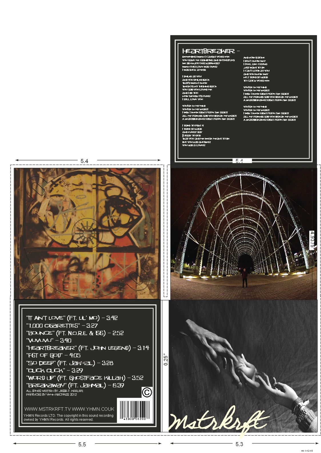
I'm glad that I included a 6th page for a "Thank you" page as I think this adds to my DigiPak and gives it a more personal feel. I found from my research that thank you pages are one of the most popular features of an album for my target audience so it was therefore very important that I included this within my work. As a page like this makes the target audience feel as though they know the artist that little bit better and creates a stronger relationship between the two.
I have also made other small changes to my DigiPak, for example making the centre of the CD page grey, as I learnt from looking at Real media artifacts that the centre of the Cd is often clear plastic or black plastic so I have coloured this to match my house style. Overall, I am happy with the images that I have used within my DigiPak, as they are all quite eye-catching. I am glad that I edited all the images as I think this has allowed me to get the best possible images. I think editing the image of the arch was a good idea because I added more red and yellow tones to the image, so that it links in with the rest of the DigiPak and does not look out of place. The framing I have used on the pages including text in my DigiPak add more depth to the pages, without them I think the pages would look quite dull.
I have also made other small changes to my DigiPak, for example making the centre of the CD page grey, as I learnt from looking at Real media artifacts that the centre of the Cd is often clear plastic or black plastic so I have coloured this to match my house style. Overall, I am happy with the images that I have used within my DigiPak, as they are all quite eye-catching. I am glad that I edited all the images as I think this has allowed me to get the best possible images. I think editing the image of the arch was a good idea because I added more red and yellow tones to the image, so that it links in with the rest of the DigiPak and does not look out of place. The framing I have used on the pages including text in my DigiPak add more depth to the pages, without them I think the pages would look quite dull.
2nd draft DigiPak

Draft for the thank you page:
Thank you
It's taken me three long years to put this album together and I would like to thank every single individual that has bought it. Lost in Love has meant a lot to me over the years and helped me through many hard times, and I can only hope that it will be the same for you. I hope that all my fans enjoy this album as much as the last one, and that I maybe interest someone new! Over the years I have been lucky to have such a faithful audience and I can only thank you. Honestly, you are the people that make this all worth it so thank you so so much. I'm always interested to know what you people think of new songs so please get in touch with me and let me know! You can email me at RobDobbie@hotmail.co.uk or you can always leave a comment on my website Mstrkrft.tv.
Editing
To improve my ancillaries, I went over my main image on the front cover of my DigiPak and Magazine advert as certain parts of the image were out of focus and I was not completely happy with the image. I have not made any drastic changes, just edited the image slightly to improve small parts of it. For example, I felt that I needed to add more of the female hand on the second layer as it was too faded. As well as this I made the males hands more in focus to show more detail. I also made the centre of the image lighter to make it more dramatic.
1st Edit:

2nd edit:

2nd edit made slightly darker:

How to improve my DigiPak
Originally I was planning on making the album self titled after the band Mstrkrft, however when I had finished my first draft of my DigiPak I found it looked unprofessional without an album name. I have therefore brainstormed some album name ideas, the name of the album needs to tie in with the song titles on the tracklist as well as suiting the images I have used within the DigiPak. So it would probably be best if that name of the album suited the name of the song in my music promo "Heartbreaker".
Album name ideas:
Old Heart
Lost in Love
Viscous love
Life without love
Lost in Love
Viscous love
Life without love
I had lots of ideas for the name of my album, however I found a lot of them were quite depressing and I wanted my album title to be a little more light hearted so I have decided to name the album "Lost in love" as this does not give off a negative feel unlike other names I came up with such as "Viscous love" which could put people off from buying the album as it is quite a depressing name.
As well as this I also need to include one more page on my DigiPak, when planning my ancillary I found from my research that my target audience also like to see a fan-mail address so that they can get in touch with the artist. When planning my work I thought it would be a good idea to include this as well as a Thank you note from the artist, as this creates a stronger bond between the artist and the audience. I will therefore include this on my final DigiPak.
Editing Reflection for completed 2nd draft music promo
It took me quite long time to ensure that my music promo was lips-inked correctly, I found this particularly difficult because every time I put in a new shot of my artist singing the rest of my footage would move. I have not included a large amount of my artist singing because I did not want my music promo to be entirely performance based, as this was the least popular music video in my Audience Research. I therefore included only a couple on shots of my artist singing throughout my music promo, and generally only used parts of him singing the chorus. I am happy with how this looks in my music promo as I think showing him performing helps to promote him as an artist. I am also glad that we decided to dress him in casual clothes for this part, as I think this makes him seem more human and therefore more likable.
When editing my music promo I tried not to over do it, as I think it would have been easy to make my music promo look unnatural and unprofessional by over editing it. At times I adjusted the lighting and brightness when editing, as certain footage was either far too dark or had bright light that looked unnatural. I think the lighting was probably the biggest negative of filming at night time, as it was hard to ensure that the lighting was good enough to film or didn't look too harsh. However, I am really glad that I chose to film at night time because I like the effect that it gave my footage, as it made it look more edgy and young. I think if I had filmed all my music promo in the day, my target audience would be less inclined to watch it as filming at night makes it more intriguing.
When editing my music promo I tried not to over do it, as I think it would have been easy to make my music promo look unnatural and unprofessional by over editing it. At times I adjusted the lighting and brightness when editing, as certain footage was either far too dark or had bright light that looked unnatural. I think the lighting was probably the biggest negative of filming at night time, as it was hard to ensure that the lighting was good enough to film or didn't look too harsh. However, I am really glad that I chose to film at night time because I like the effect that it gave my footage, as it made it look more edgy and young. I think if I had filmed all my music promo in the day, my target audience would be less inclined to watch it as filming at night makes it more intriguing.
Friday, 16 November 2012
Filming for my 2nd draft music promo
I knew from editing my first draft what I needed to reshoot and what new features I needed to film for my music promo. Before I starting filming again I made a written plan to take with me so that my filming would hopefully be more organised and quicker. My main focus for filming again was to make sure I had good shots of my artist Rob singing. As I did this in a badly lit area first time round, I decided to change location this time to film him singing in the skatepark. As I really like the yellow tones from the lights in this location, and thought it would work well with the lyrics as he sings. I thought it would be a good idea if my artist wore a new set of clothes, as I learnt from looking at Real media artefacts that artists normally seperate their scenes of performance and narrative by wearing different clothes. If my male character was wearing the same thing this could be seen as confusing to the audience as they would think the singing ties in with the narrative. I therefore asked my male character Rob to wearing something a little more casual compared to the shirt he wears in other parts. Before we set off filming I went to his house and we chose a plain grey tshirt, jeans and a parka coat. All of these clothes have quite simple colours which we thought would work well because it's important that he is the main focus, not his clothes. He also opted to wear a beanie hat, I thought this was fine because it is typically a young thing to wear and particularly works well with the "skater boy" vibes that feature in my music promo.
When it came to filming Rob singing I started by using the fisheye lens, as it looked really effective when he stood in the middle of the half pipe (a type of skate ramp) this worked well because the sides of the ramps curved up around him to give an unusual shot. I thought this would be effective within my music promo as it adds a little something extra to make my music promo more interesting. As well as this I also filmed various close up and extreme close up shots to show the emotion on his face. I found it was quite difficult to keep his face entirely in focus when filming the extreme close ups when using a normal lens, as he moved slightly as he sung which made him go in and out of focus. This was quite unfortunate as there are some really good shots of him singing which I would have liked to have used but they are too blurry. However, I have tried to include some of this within my music promo as I think when it is included in a subtle way it does not look too bad.
Another important factor that needed focusing on was improving the storyline of my music promo. As I found it difficult to completely stick to my storyline when filming. My original storyline included a number of male characters acting as well as skating, however I found this almost impossible to do as I could not find any males that wanted to act in my video apart from my main character. I therefore had to change my storyline slightly in order to make it work with just me and Rob in it. I thought the best way to do this would be for the female character to be cheating on the main character. I drew up a new storyboard and came up with the idea of using a mobile phone to show that the female character is organising to meet up with another man. I thought this would be effective because it is clear, as I did not want my storyline to become confusing to my audience. Although using a mobile phone to show texts from another man could be seen as quite cheesey, I think it works well in my music promo as it gives the video a stronger narrative. At the end of my music promo I thought the most dramatic ending would be for the female character to walk off holding a different mans hand, as this links in with the song "Heartbreaker".
Other features that I wanted to film included quick shots of the couple (me and rob) kissing or hugging, just to make it more clear to the audience that we were together. This was quite easy to shoot as I have been using a tripod so we were able to both stand infront of the camera.
I am glad that I have been able to use my own SLR camera when filming my music promo, as it has allowed me to go out and film whenever I want. This week I have filmed most nights, and I feel like this has really helped me to get on top of what I wanted to achieve.
Updated version of the storyboard:


Tuesday, 13 November 2012
Dolby
Fab images and a great house style here with the ancillaries. Do you want the album title on the front of the digipak?
Make sure to upload the original images and how you have manipulated them to show your ICT skill. It will make it easiert o reflect on later.
Monday, 12 November 2012

Completed first draft DigiPak

Friday, 9 November 2012
Magazine advert first draft
When doing my planning for my magazine advert, I made several different layouts in order to see which design was most effective. I then took forward my two favourite layouts and asked ten people that link in with my target audience which one they prefer. This layout was the favourite as 7/10 people preferred it, I am happy with this result as I also prefer this layout too. I think it is more effective as the image is slightly bigger than my other designs, it is therefore slightly more simplistic, which shouldn't be seen as a negative thing as the minimal style could be seen as quite up to date and fashionable. I have therefore made my first draft of my magazine advert, by including my chosen font and using the quotes and ratings that I want. Although this still needs a lot of work, I am still quite happy with how it is coming along.


Images for my ancillary
I have done two photo shoots since starting the ancillary construction, one took place in the skate park as I wanted to capture images of the graffiti which features on the ramps. I chose to photograph this as I thought it would link in nicely with my target audience as graffiti is generally linked to young adults. I took various images of all the graffiti in the skate park, in order to get the best shot possible. I was actually quite surprised at how good some of the graffiti work was, as some things were really artistic. I'm therefore glad that I chose to include this in my DigiPak as I think it will work really well with the rest of my work. I have edited a range of images from the photo shoot to see what works best. I want to be sure that I choose the correct image to be in my DigiPak, it may be good idea to show a number of young adults that tie in with my target audience which image is their favourite, to ensure that my DigiPak is effective.
Here are some images I have edited from the skate park shoot:


 I started the editing process by layering the images together one on top of the other and then changing the opacity for each layer to suit the image. However, this did not look successful as I unfortunately forgot about my watch in these images. This caused a bit of a problem when it came to editing because my watch and bracelets in the images made me look like I had an arm made of metal when I edited the images one on top of the other. To stop this from happening I used a different approach when editing, by using the clone stamp tool and selecting the exact point that I want to copy and placing it on the main image. I found this a lot easier as I then had full control of what I wanted to put on my main image. Once I was happy with how this looked I then edited the background to diminish any creases on the sheet in the background, as these look quite unprofessional. I then tried altering the colours to look darker but I found the image looked more effective in black and white as it was more suited to the brand of my artist.
Final image:

Here are some images I have edited from the skate park shoot:


The next day, I then went out and did a second photo shoot in the IQ Business Park which features in my music promo. I wanted to include this location in my Digipak because it is very well lit and has impressive architecture which makes it quite a beautiful place. Therefore, I thought it would work well in my DigiPak. My ideas for this shoot were quite simple, I chose to take a fish eye lens with me as this allowed me to capture more in one take, this was beneficial as it allowed me to capture the architecture in the IQ Business park to show its full beauty. For example, there is a large archway in the IQ which I was able to capture successfully because I used a fish eye lens. I'm really glad I did this, as I think my images look really effective. I took some images with and without my main character, as I was not sure which works best. Here is an image I have already edited of this photo shoot:

For my front cover I took 3 separate images as I plan on editing them together on photoshop to create one image. I came up with this idea as I thought it would be an effective image that would hopefully draw peoples attention and make people interested in buying the album. I learnt from my RMA's that a dramatic front cover is generally popular as it's important to make an impact on your audience. This is therefore what I was aiming for, as I wanted an unusual image that stood out. Originally, I was planning on using a red background as this linked in with my chosen colour scheme. However using colour in my images did not look as effective as I first thought, as the red sheet I used as my background looked too bright as the lighting is very harsh. I felt this would look out of place when sitting on my Digipak with the other images I have taken, as my other images are darker and do not include many bright colours.
Here are my three separate images that I will edit together:

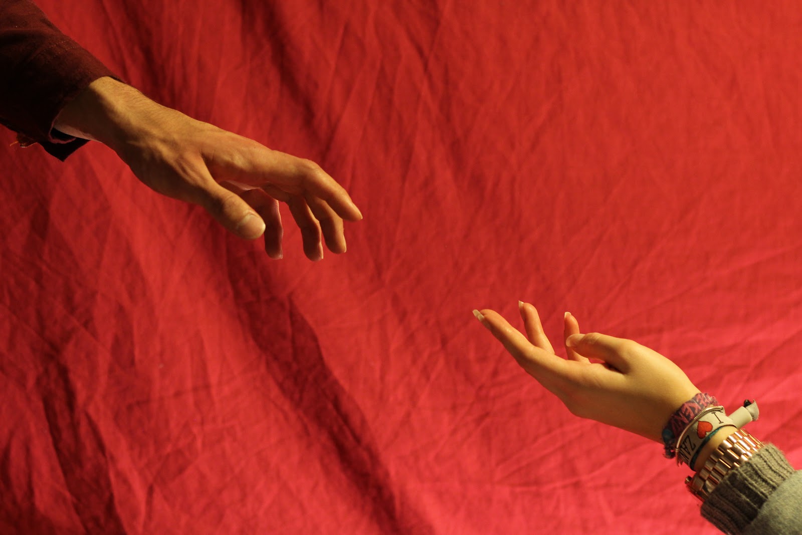
Final image:

Dolby
It seems that asking the audience has been effective and this planning is effective. Now look at images, layouts and colour schemes.
Thursday, 8 November 2012
Preferred fonts

Tuesday, 6 November 2012

Monday, 5 November 2012
Constructing my DigiPak
I have thought about what images will be most effective in my DigiPak by planning what image will work well on all four pages. On the front page the album art will focus on something that relates to my music promo, such as the couple, rollerblading or the male character alone. I am planning on taking a range of shots, so that I have more options when it comes to deciding what works best, as I need to ensure that the front of my DigiPak is eye catching in order to grab my target audiences attention.On the front of my DigiPak it is essential that I also include the artist name and album title. On the inside of my DigiPak I will include a track list on the left hand side. I am also considering making this into a leaflet as this will make my DigiPak more interesting for my audience, as the page that features the track list could then fold out to show lyrics for the songs. I think the lyrics would work well in my DigiPak as I found in my questionnaire they were the most popular feature of an album to my target audience. Next to this, on the right hand side of the inside of my DigiPak I will have the CD. I am considering featuring some sort of pattern or close up shot that links in with my music promo on this page, such as graffiti which features on the walls of the skate park in my music promo. A pattern such as this would look better than an image of a character as I could then feature this on the page and on the CD itself, so when the CD is separate from the album the image will still be intact. On the back page of my DigiPak I will then feature an image that is very simple, or I will just include a coloured background. As I have learnt from the Real Media Artefacts that the back pages of DigiPaks are normally very plain and simplistic as they are not the main focus. On this page I will also include a message to the audience from my artist, as this makes the album seem more personal and is likely to have a positive effect on my target audience. As well as this I will also add a fan mail address on this page, as this creates a closer relationship between the artist and the audience which will help to promote my artist.
Mrs D
This is a great first draft Olivia. Well done. I like the focus pull at the beginning and the CUs of the artist. More of these please to improve. The colour is very effective and the Movement shots of the skaters are brilliant.
Subscribe to:
Comments (Atom)