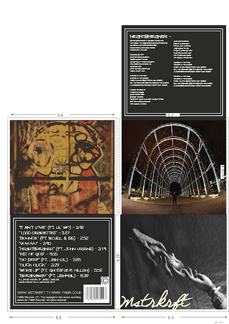
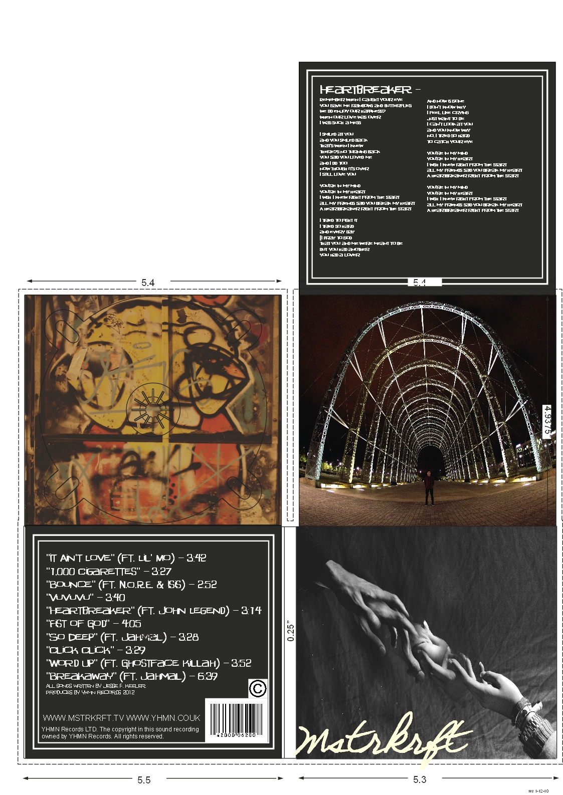
Overall I am happy with how my Digipak has come together, planning my ancillary in advance really helped me when it came to constructing as I already planned what features I wanted on each page and had already planned what colour scheme would link in well with my music promo and magazine advert. I think the use of the colour red links in well with my main artist as he is wearing a red shirt in parts of my music promo, it was therefore important that I included this colour in my Digipak as I wanted it to link with my artist. The use of yellow tones also link in with my music promo, as the skate park has very warm yellow lights. I tried to link this in slightly with the title on the front cover, by making "Mstrkrft" a cream colour instead of bright white as it gives it a warmer, less harsh feel to it which suits the romantic feel better. I learnt from my RMA Research that many back covers do not include bold images, as the focus is mainly on the track list. I chose to use this in my own work as I think the track list should be the main focus. It was important that my choice of fonts flowed throughout the DigiPak, I therefore used the same font on my back page and on the inside leaflet. When choosing my font I looked at my RMA Research and found that Capitals were commonly found on the back of albums as they usually include a lot of text so the text therefore needs to be clear and easy to read. I chose this font because it links in with the use of graffiti in my music promo, and I think that this also ties in well with my target audience of young adults.
No comments:
Post a Comment