I have done two photo shoots since starting the ancillary construction, one took place in the skate park as I wanted to capture images of the graffiti which features on the ramps. I chose to photograph this as I thought it would link in nicely with my target audience as graffiti is generally linked to young adults. I took various images of all the graffiti in the skate park, in order to get the best shot possible. I was actually quite surprised at how good some of the graffiti work was, as some things were really artistic. I'm therefore glad that I chose to include this in my DigiPak as I think it will work really well with the rest of my work. I have edited a range of images from the photo shoot to see what works best. I want to be sure that I choose the correct image to be in my DigiPak, it may be good idea to show a number of young adults that tie in with my target audience which image is their favourite, to ensure that my DigiPak is effective.
Here are some images I have edited from the skate park shoot:
The next day, I then went out and did a second photo shoot in the IQ Business Park which features in my music promo. I wanted to include this location in my Digipak because it is very well lit and has impressive architecture which makes it quite a beautiful place. Therefore, I thought it would work well in my DigiPak. My ideas for this shoot were quite simple, I chose to take a fish eye lens with me as this allowed me to capture more in one take, this was beneficial as it allowed me to capture the architecture in the IQ Business park to show its full beauty. For example, there is a large archway in the IQ which I was able to capture successfully because I used a fish eye lens. I'm really glad I did this, as I think my images look really effective. I took some images with and without my main character, as I was not sure which works best. Here is an image I have already edited of this photo shoot:

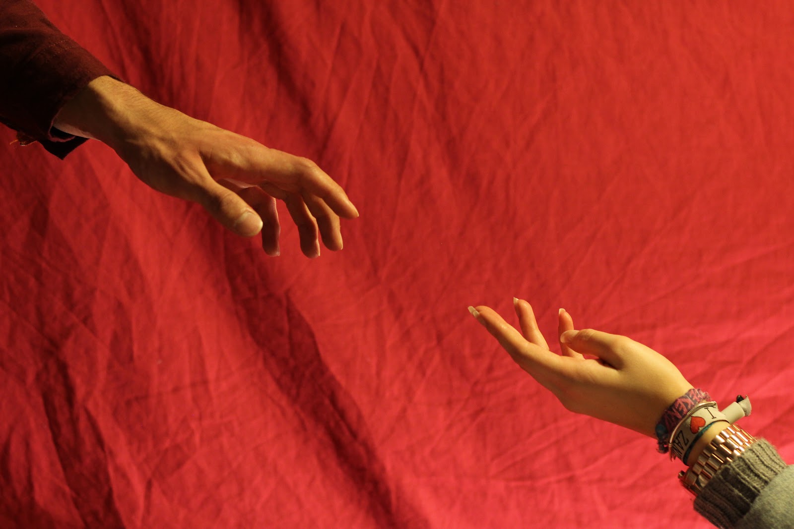
For my front cover I took 3 separate images as I plan on editing them together on photoshop to create one image. I came up with this idea as I thought it would be an effective image that would hopefully draw peoples attention and make people interested in buying the album. I learnt from my RMA's that a dramatic front cover is generally popular as it's important to make an impact on your audience. This is therefore what I was aiming for, as I wanted an unusual image that stood out. Originally, I was planning on using a red background as this linked in with my chosen colour scheme. However using colour in my images did not look as effective as I first thought, as the red sheet I used as my background looked too bright as the lighting is very harsh. I felt this would look out of place when sitting on my Digipak with the other images I have taken, as my other images are darker and do not include many bright colours.
Here are my three separate images that I will edit together:


I started the editing process by layering the images together one on top of the other and then changing the opacity for each layer to suit the image. However, this did not look successful as I unfortunately forgot about my watch in these images. This caused a bit of a problem when it came to editing because my watch and bracelets in the images made me look like I had an arm made of metal when I edited the images one on top of the other. To stop this from happening I used a different approach when editing, by using the clone stamp tool and selecting the exact point that I want to copy and placing it on the main image. I found this a lot easier as I then had full control of what I wanted to put on my main image. Once I was happy with how this looked I then edited the background to diminish any creases on the sheet in the background, as these look quite unprofessional. I then tried altering the colours to look darker but I found the image looked more effective in black and white as it was more suited to the brand of my artist.
Final image:


No comments:
Post a Comment